
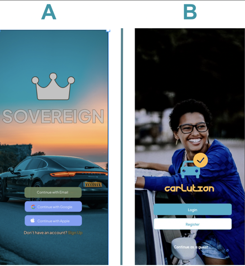
The journey of designing Sovereign began with a clear purpose: to address the common frustrations car owners face when managing maintenance tasks. As the head of the design team, I was tasked with leading a project that would not only simplify car maintenance but also deliver a seamless, user-centered experience. This case study explores the steps taken to bring the Sovereign app to life, from understanding user pain points to launching a functional prototype.
Car owners often face numerous challenges in managing their vehicles. Keeping track of maintenance schedules, service records, and unexpected repairs can be a daunting task. Many rely on physical paperwork, calendars, or fragmented digital solutions, which often result in missed appointments, misplaced records, or costly emergency repairs. Additionally, the process of finding trustworthy service providers can feel overwhelming, as existing platforms often lack transparency and user-friendly navigation. These issues create unnecessary stress and time-consuming hurdles for car owners, detracting from the overall experience of vehicle ownership.
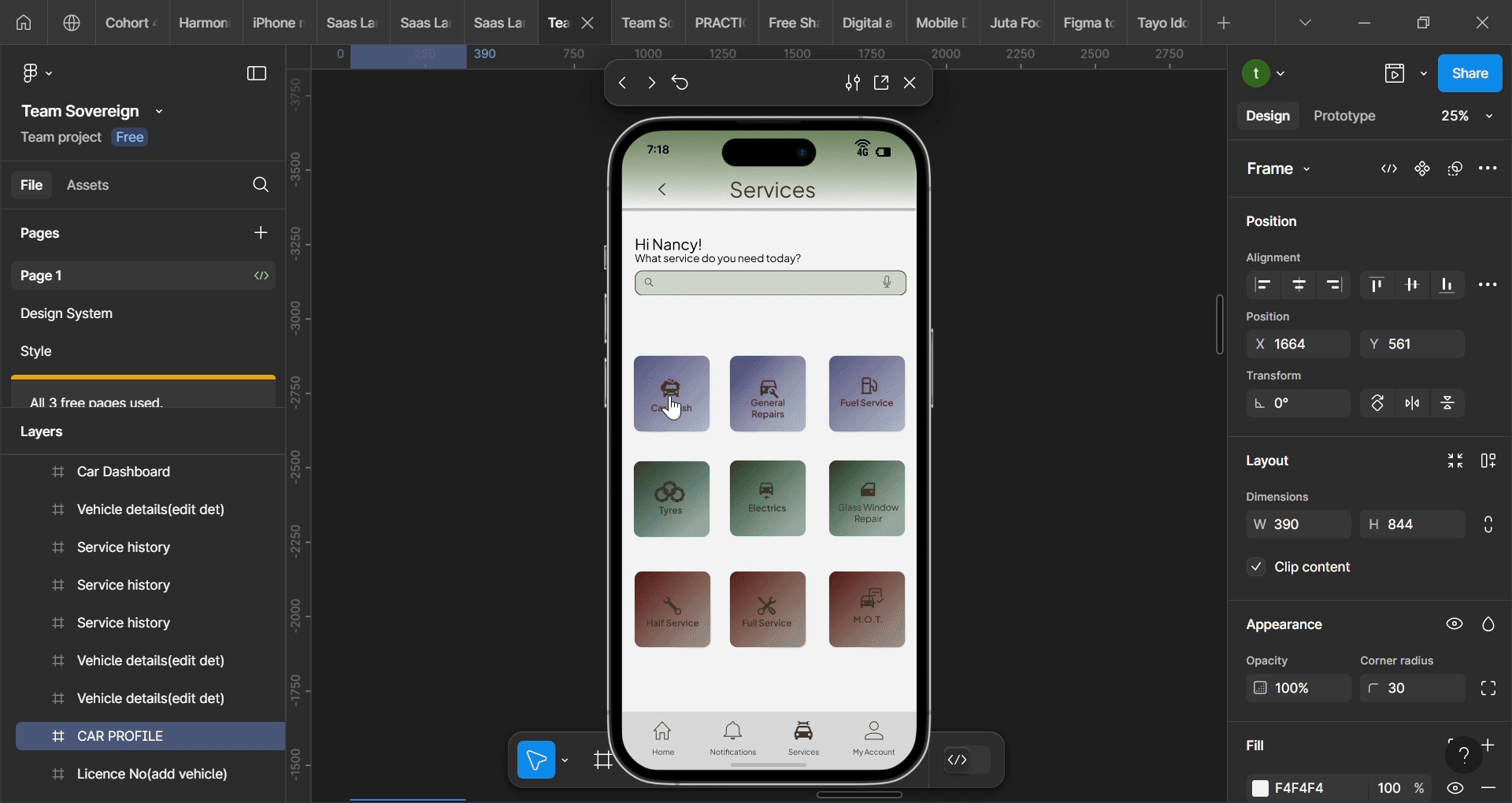
The Sovereign app set out to solve these problems by offering a comprehensive and intuitive platform. The goal was to create an app that would:
To build a solid foundation for the app, we conducted extensive research to understand the pain points of car owners and service providers. The process involved: Research Report
We had 5 participants complete 4 A/B Tests. These tests were created to test users response to the Sovereign’s app design. Insights from the responses in the test will determine if and how to modify our final design.
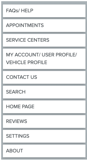
The illustration on the left, shows the content that would be expected to feature on different pages of the app.
The illustration on the right, shows the contents that have been grouped together based on the themes/headings/: Home, User account & Maintenance. This depicts how the user will view options on the app based on which category they choose.
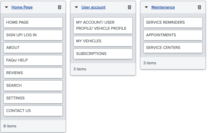
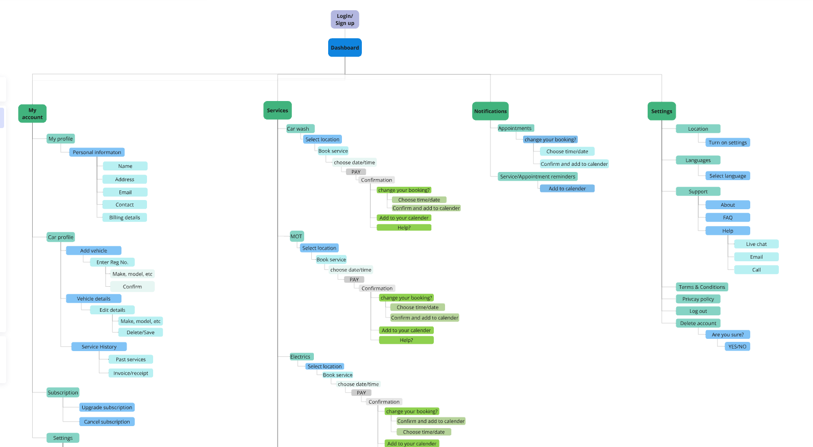
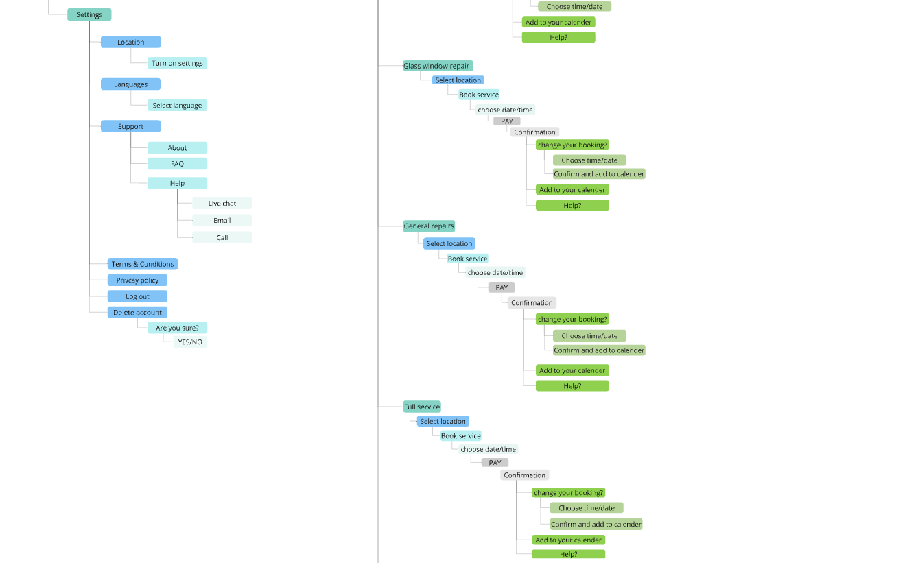
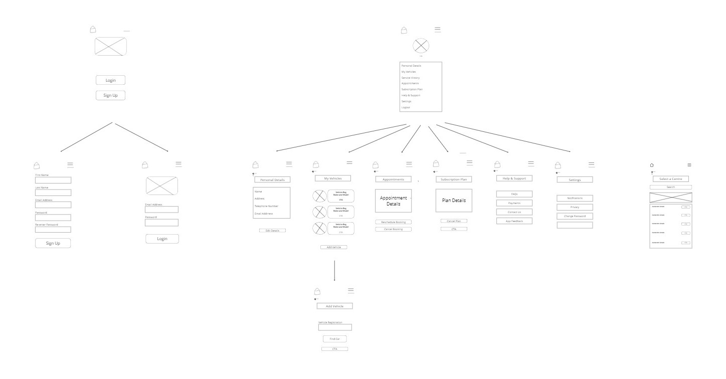
The information architecture (IA) was designed to provide users with a clear and intuitive navigation experience, ensuring they could easily locate services, manage their vehicle information, and complete tasks efficiently.
The research has enabled us to understand that 63% of users would consider subscribing to the app. However, only 30% confirmed that they would be happy to upgrade to a paid monthly subscription, with 20% still uncertain about a decision. Some of the considerations were that they already had trusted mechanics and some participants felt that the app would not be particularly useful to them as their vehicles are fairly new and reliable so they would not be able to justify paying.
All the users spoke about how significant their experience of using the app could make them continue to find value in it. Users spoke about wanting the app to be easy to use and navigate, having a clear interface and being able to use the app without glitches or slow loading times. A number of participants said that they would be put off using the app if there were too many follow up emails, pop up adverts whilst using the app and if the app requested too many personal data information that could not clearly be accounted for.
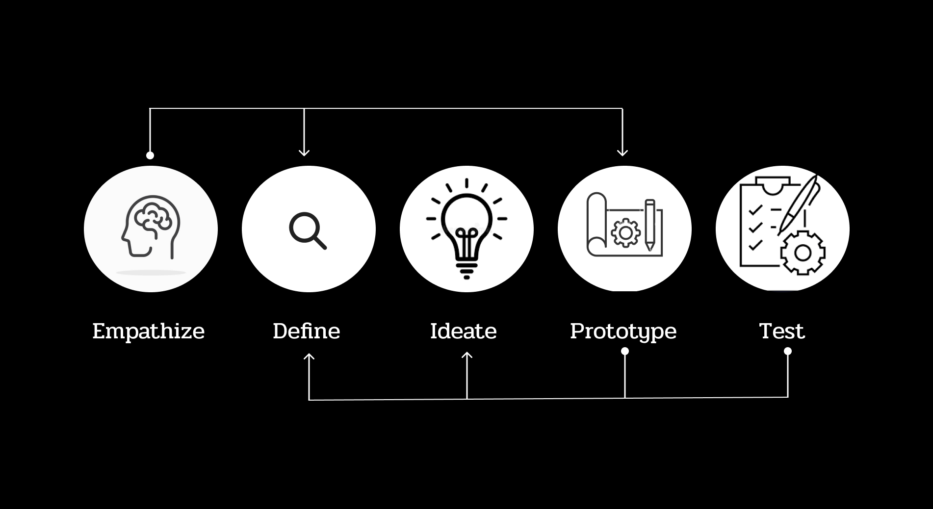
Armed with research insights, I led the design process through a human-centered approach:
As a user, I want to be able to enter my car registration number into the app so that it generates my vehicle details.
Acceptance criteria: Given that the user enters the correct registration, the app should generate the vehicle details (Make, model, etc.) and ask the user to confirm.If the user enters an incorrect registration number, an error message appears informing the user that vehicle details were not found.
Edge Case: In the case of a brand-new vehicle, where car registration does not come up, the user is able to enter vehicle details manually.
As a user, I want to be able to click on my profile so I can view and edit my details.
Acceptance criteria: When the user clicks on the profile icon, they should be presented with a page showing all their personal and vehicle details. There should be a button in each section giving them the option to edit their details.
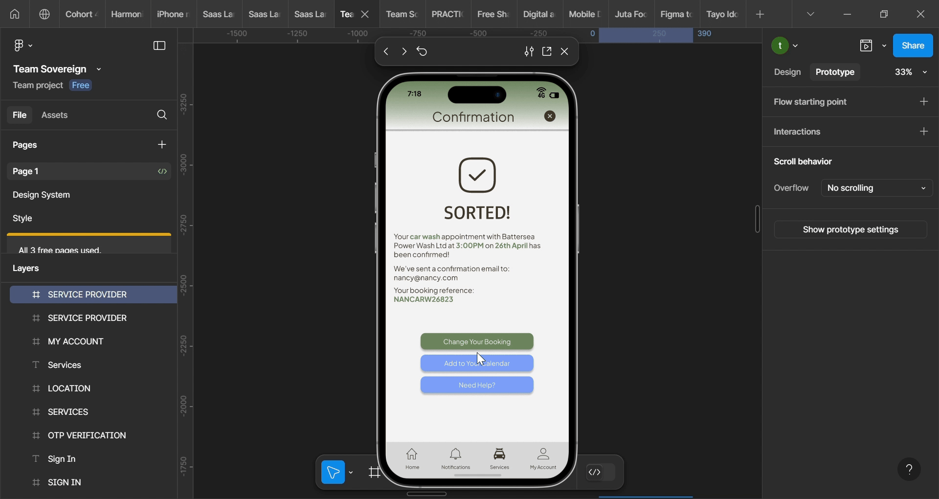
As a user, I want to be able to cancel or reschedule my appointments so I don't get billed when I can't make them.
Acceptance criteria: Provide users with clear timeframes for cancellations/rescheduling of appointments (e.g., 48 hours before).When the user goes to view their appointments, there should be a button to click to change/cancel their appointment if it falls in the accepted window.
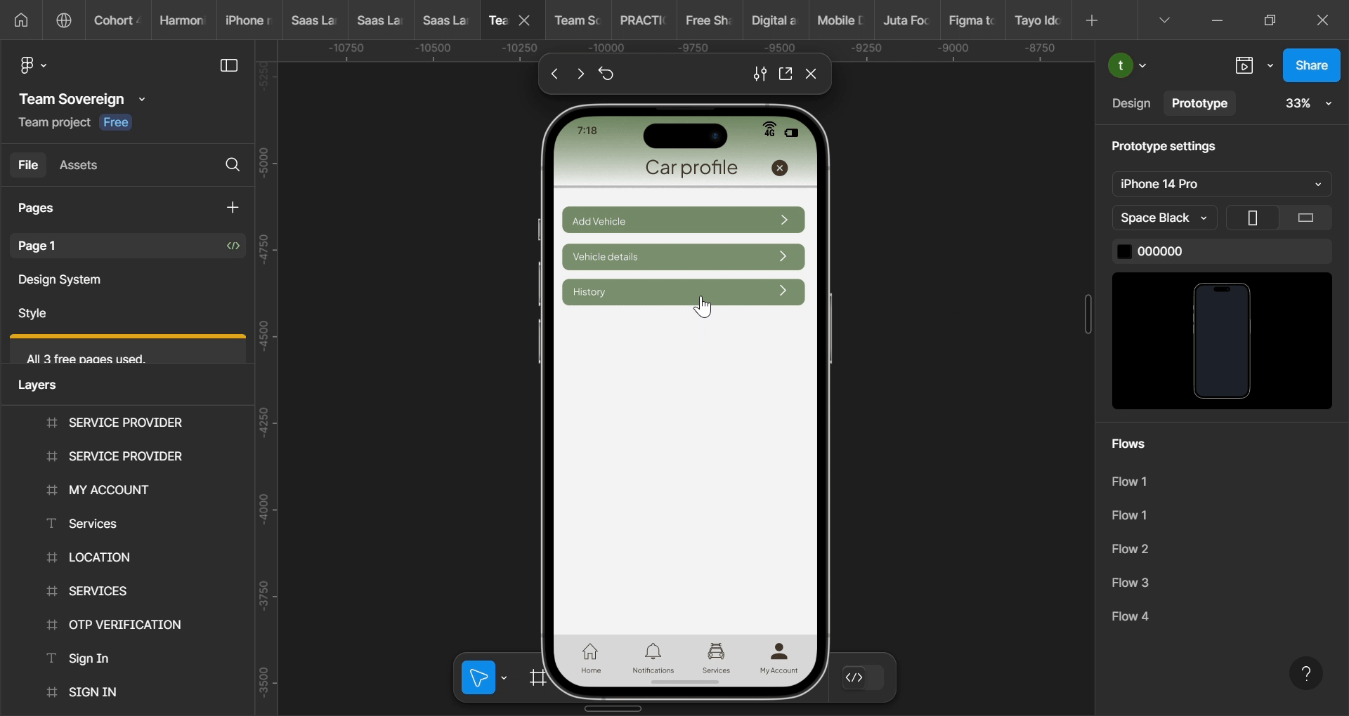
As a user, a personal user, I want to be able to save all my cars maintenance information digitally so they can refer back to it when needed.
Acceptance Criteria: In the car section tab, you can select service history to see past maintenance services.


The final prototype of Sovereign was well-received during usability testing. Users appreciated the app’s intuitive navigation and the convenience it brought to car maintenance, as it directly addressed the personas' pain points, such as difficulty in keeping track of maintenance schedules and accessing service records.