Juta is a next-generation mobile app that redefines the food ordering experience. Designed from scratch with user convenience at its core, Juta offers a seamless interface and innovative features to make finding, customizing, and ordering your favorite meals effortless and enjoyable. This case study outlines the design journey, from research to implementation, showcasing how I created a user-friendly solution that includes personalized recommendations, streamlined order tracking, and loyalty rewards to enhance user satisfaction and engagement.
The goal of the app is to simplify the food ordering experience by offering a diverse selection of restaurants, streamlined ordering processes, and personalized options to meet the needs of our consumers, ultimately providing a convenient, efficient, and enjoyable experience.
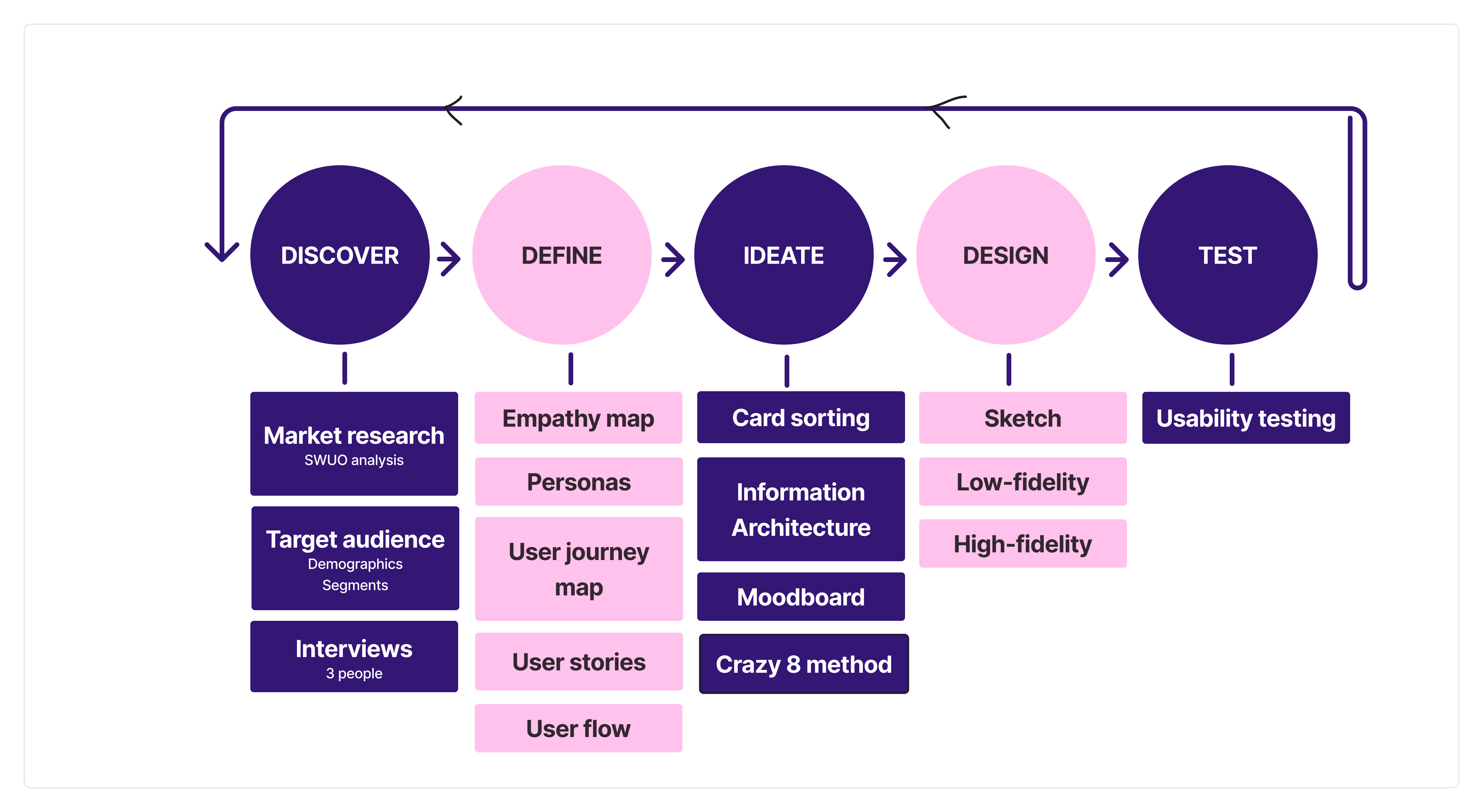
As the sole creator of the app, I spearheaded every aspect of its development. From conducting comprehensive user research to designing the interface, every decision was meticulously crafted to ensure a seamless and intuitive user experience, resulting in a successful app that meets user needs effectively.
The problem stemmed from the diverse needs of busy professionals, health-conscious parents, and budget-conscious students who struggled to find convenient, healthy, and affordable meal options amidst their hectic lifestyles. The app aimed to provide a solution by offering a wide range of restaurant choices, streamlined ordering processes, and customizable options to cater to their specific preferences and constraints.
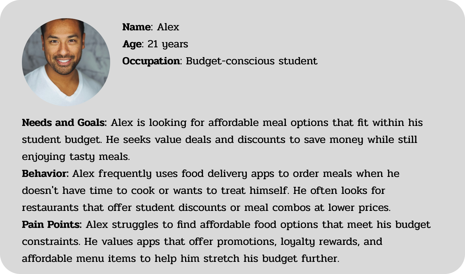
This segment includes people who focus on getting the best value for their money. They seek affordable meal options, discounts, and cost-effective meal plans without sacrificing quality or portion size.
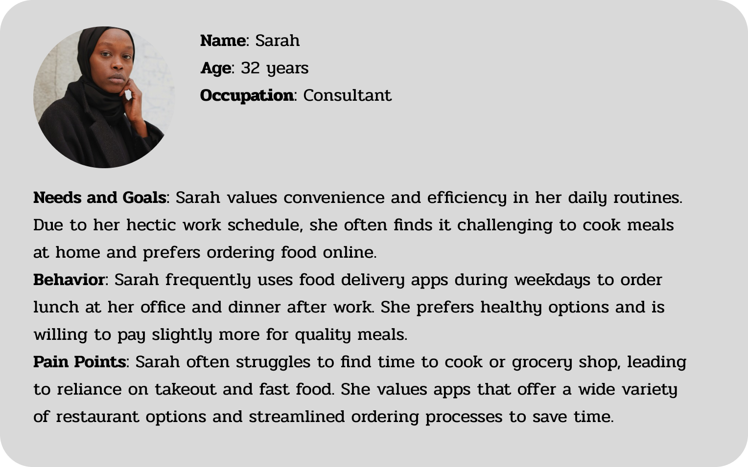
hese individuals have demanding schedules and little time to cook but still want convenient, healthy meals. They value quick delivery, meal pre-planning, and minimal prep time.
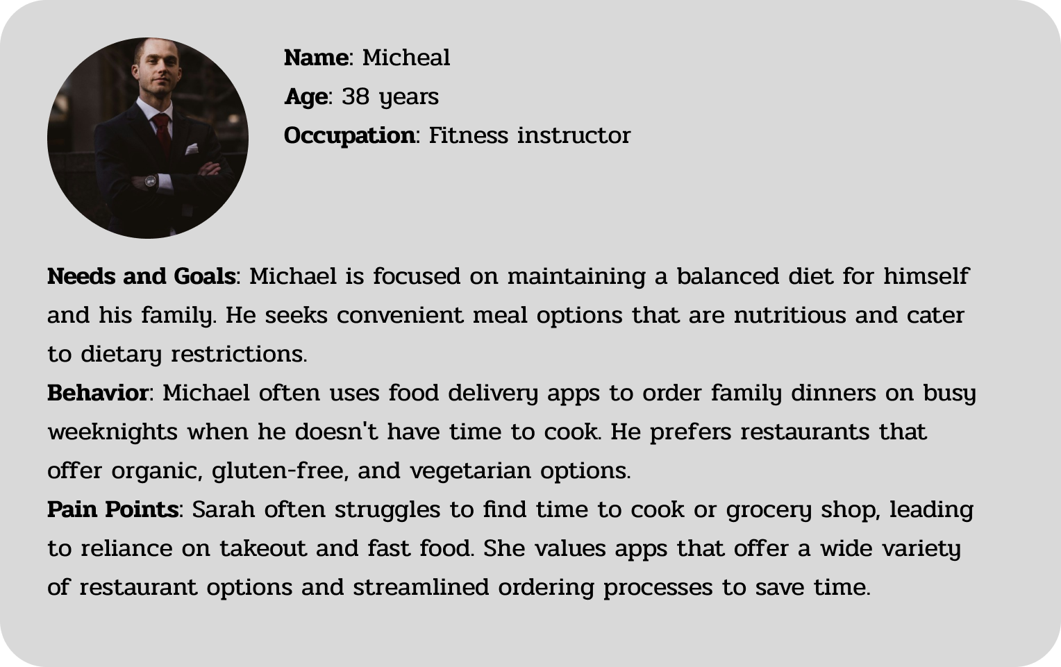
This segment is made up of people who prioritize nutrition and performance. They look for meals tailored to their dietary goals, such as high-protein, low-carb, or calorie-controlled options, and value ingredient transparency and meal tracking.
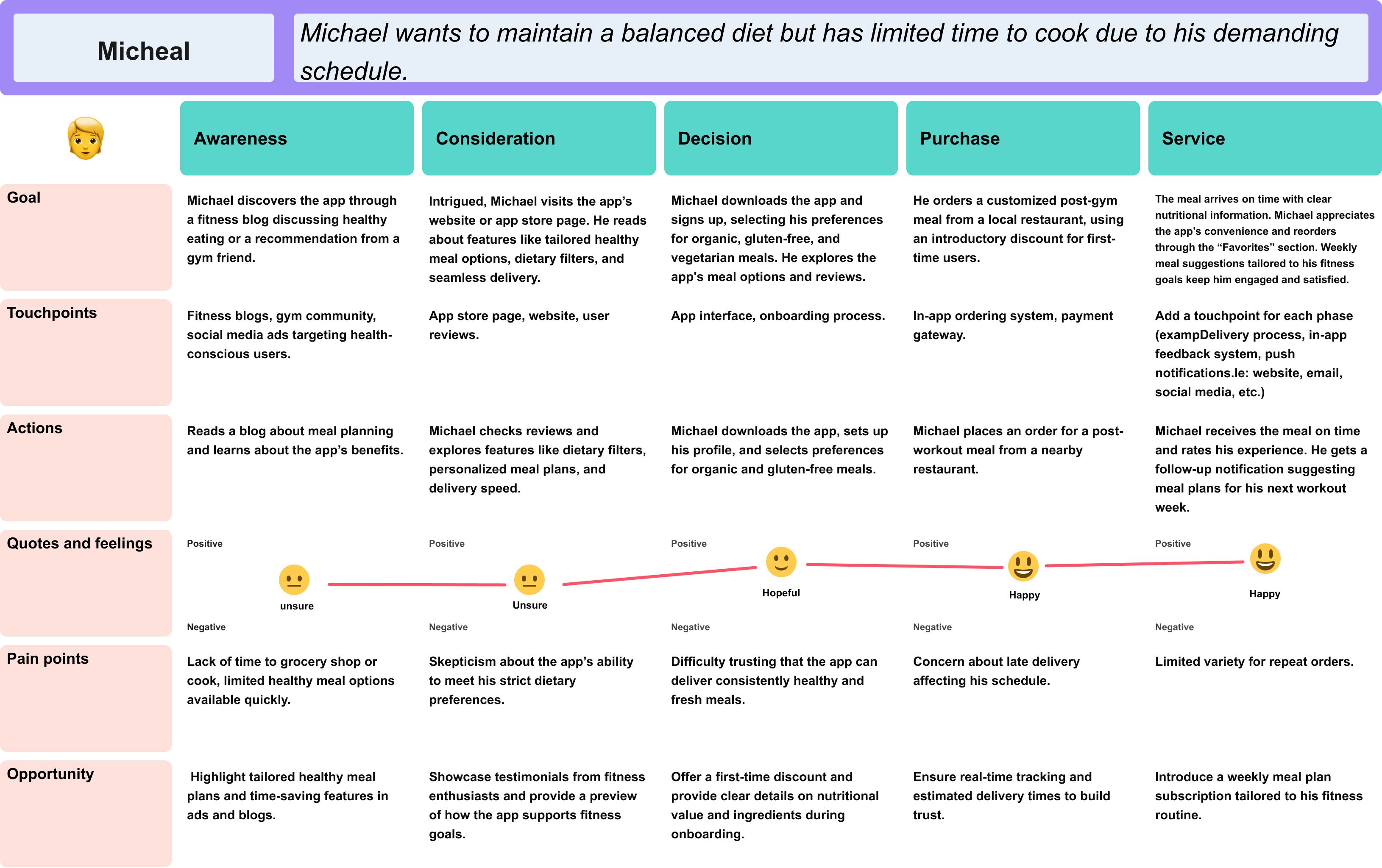
I created an experience map to help me see the big picture of Michael’s journey and gain a deeper understanding of his needs and pain points. Through this process, I identified the point of intervention: when Michael struggled to find meal options that aligned with his fitness goals while managing his busy schedule. The overwhelming nature of balancing work, workouts, and meal preparation led to a reliance on less healthy convenience foods. This not only hindered his progress but also caused frustration and dissatisfaction with his routine. Addressing this challenge provided a clear opportunity to design a solution tailored to his needs, helping him achieve his health goals without compromising his time or energy.

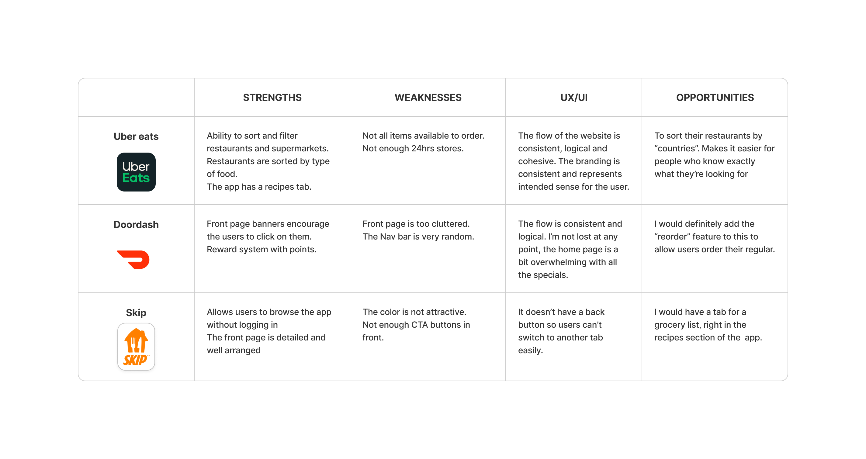
In order to identify needed features for the app, I used card sorting technique
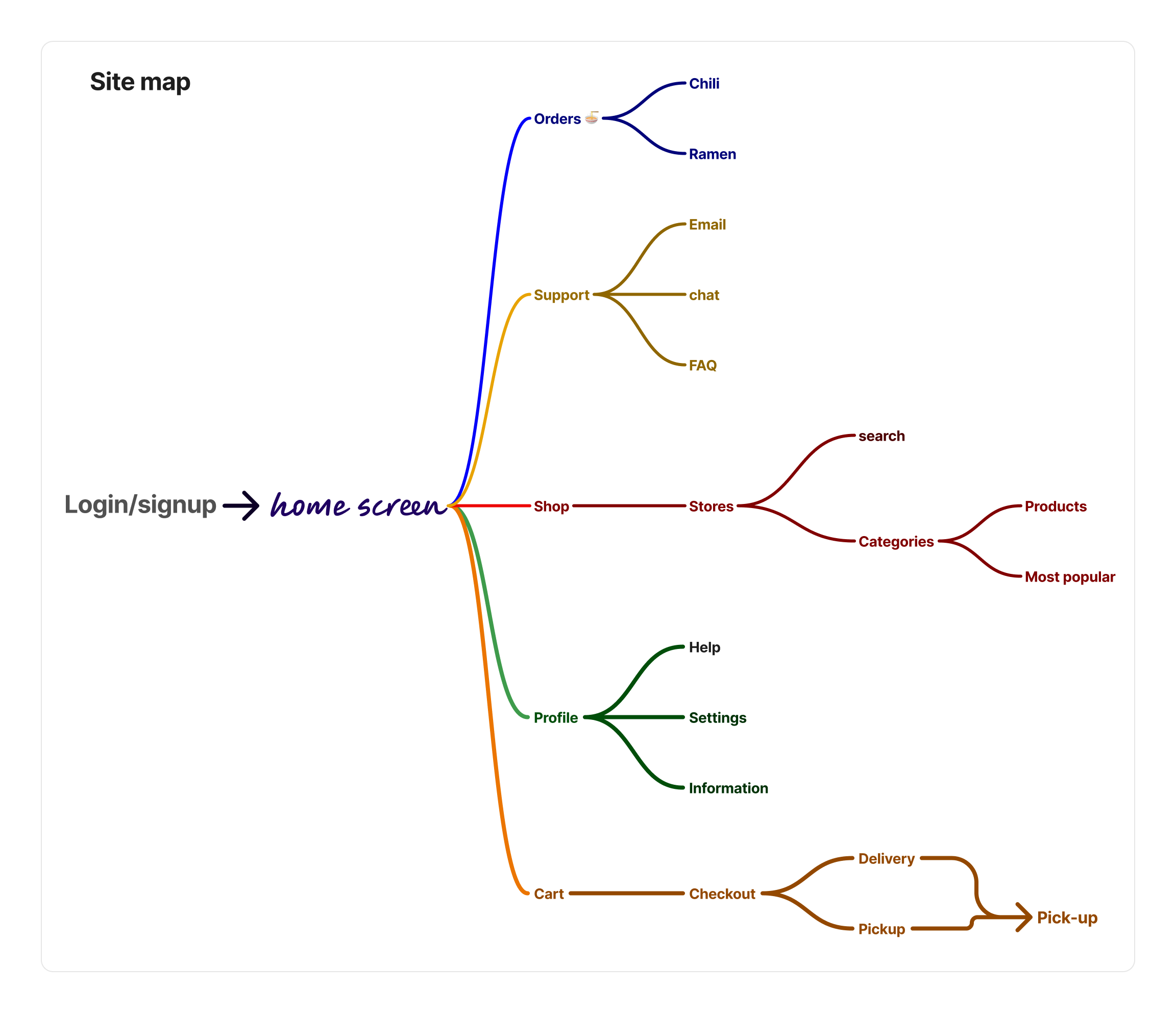
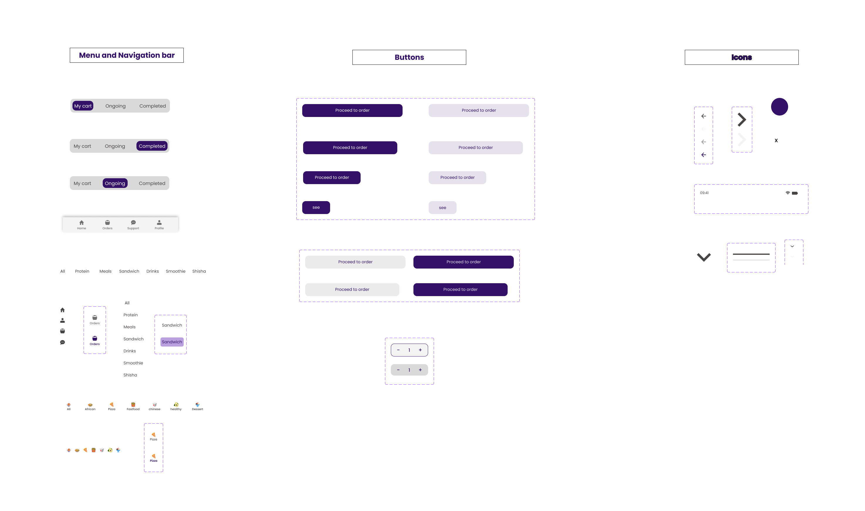
The site map for the Juta app lays out the core structure, ensuring a seamless and intuitive navigation experience. It helped define key user flows, making it easier for users to access what they need without friction.
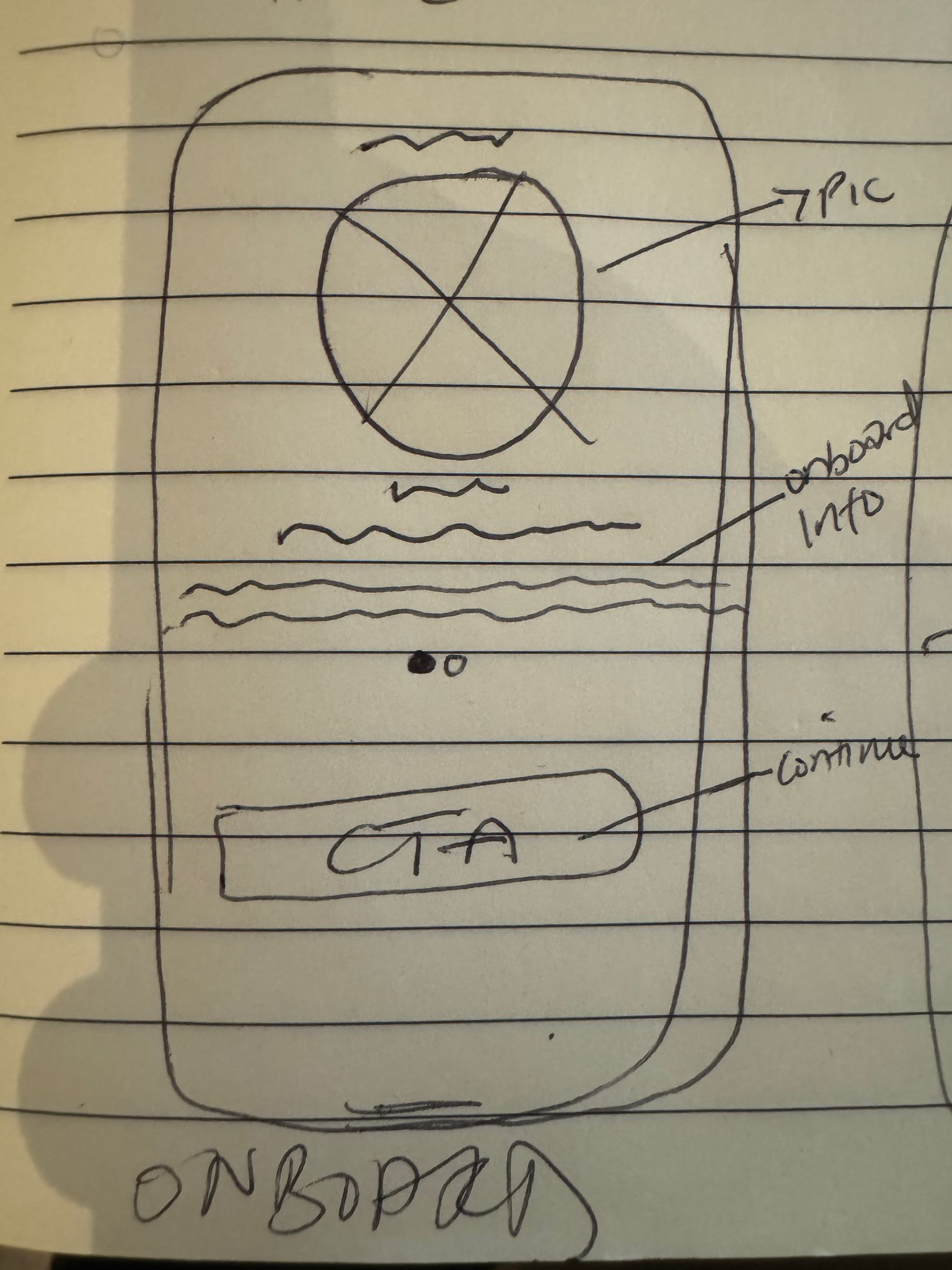
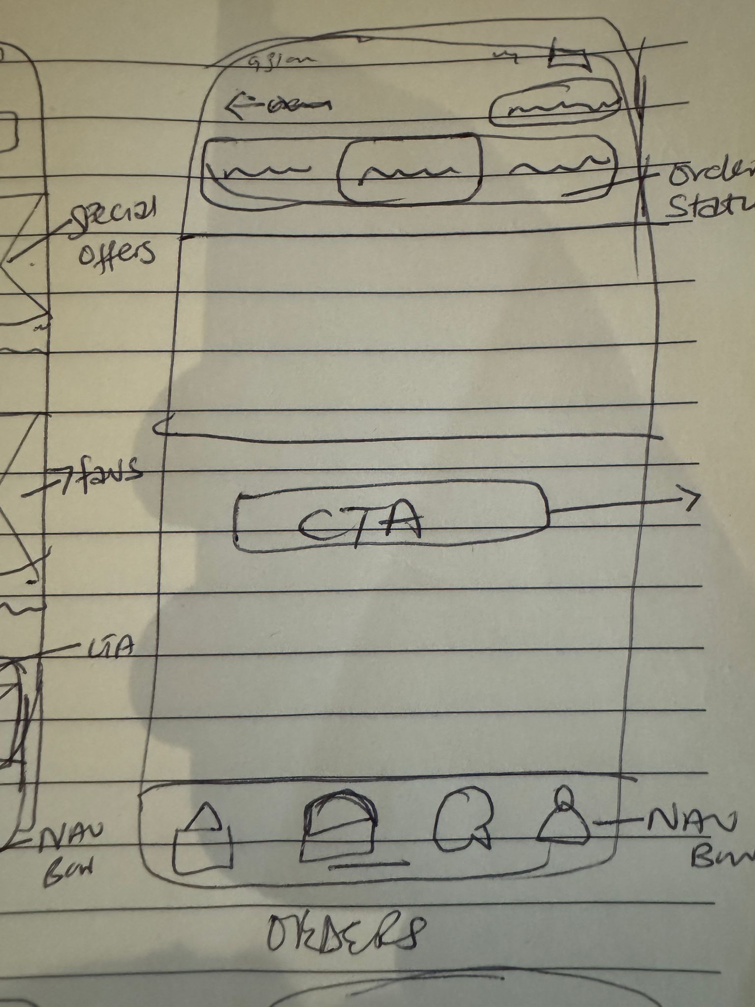
To visualize the structure and flow of the app, I created low-fidelity wireframes for the onboarding, home, and orders pages. These wireframes helped me map out the layout, prioritize key elements, and establish the user journey. By focusing on the core functionality and design hierarchy, I was able to refine the placement of components and ensure the app would deliver a seamless and intuitive user experience. I played around with a couple designs and came to this

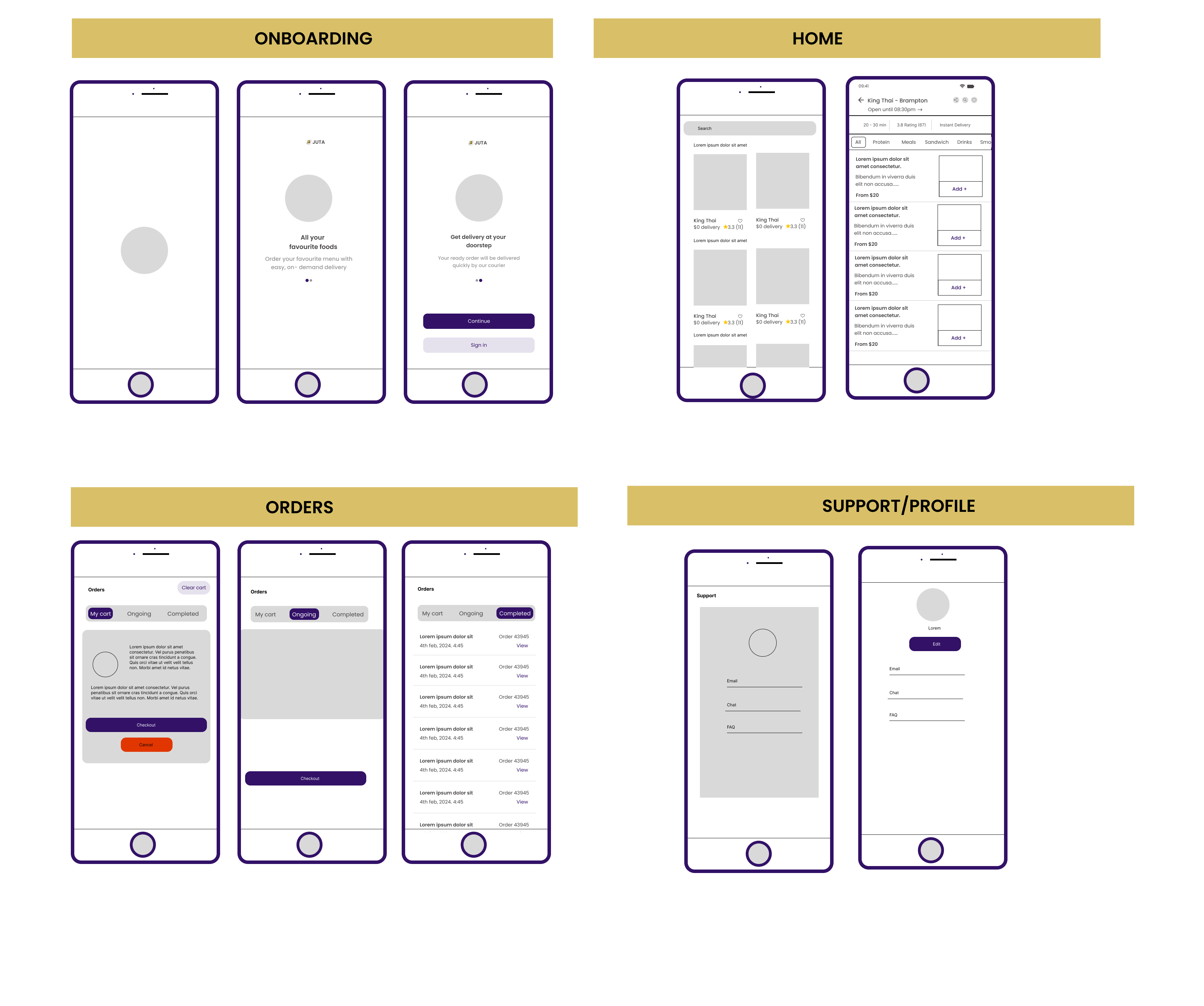
Home Page: The Gateway to DelightWhen users launch Juta, they’re welcomed by a vibrant Home Page featuring trending dishes, tailored recommendations, and exclusive deals. A smart search bar and advanced filters make finding the perfect meal as simple as a few taps.
.gif)
.gif)
Orders Page: Simplified Meal ManagementThe Orders Page is where the magic happens. Users can track orders in real-time, revisit past favorites, or customize their meals to perfection. Whether it’s Sarah reordering her go-to salad or Michael specifying gluten-free ingredients, the process is quick and intuitive.
Store filter - How to place an orderThe restaurants are already sorted on this page, users can just pick whatever they need to order based on type; healthy, Thai, Chinese, fastfood etc.
.gif)